
Lost in longitude or confused by contour lines? Want to know all the tips and tricks for getting the most out of your atlas? Curious if paper towns still exist? "Ask a Cartographer" is your opportunity to get the facts straight from the source. Tom Vitacco, Rand McNally Publishing’s Director of GIS is here to answer your burning questions, and geek out over fascinating map lore – one exploration at a time.
This week, we are discussing some interesting products that we no longer make…
Question: As a cartographer, are there any interesting products that Rand McNally no longer makes that you wish were still being made – Part 1?
Tom’s answer: Excellent question and the quick answer is yes there are quite a few products I found interesting that I wish we still made. I will go into some detail on two of these products with this post and share some of the cartographic challenges we faced along with a few of the reasons we do not make the products anymore.
When we first got this question, I took a few days to think about all the products I have worked on throughout my long career as aRand McNally cartographer. Many of these products are no longer produced, so I made a list of some of my favorites. After reviewing the list, I decided to split this into two parts, and plan to discuss two of the products (the fabMAP and the Harley Ride Atlas) this week and a couple more in a follow up blog soon.
The fabMAP
Take a microfiber cloth the size of a large handkerchief, print a colorful map on the fabric displaying a city tourist area or college campus, and you have an innovative product called fabMAP. Some early reviewers and customers called the maps and the concept “fabulous” - which they were – thinking it was the reason behind the name, but I believe the name actually referred to the map being printed on fabric. The unique part of the fabric map compared to a paper map was the fact they were waterproof, wrinkle resistant, would not tear or rip easily, and you never had to worry about folding the map since it could be balled up and placed into your pocket or purse. An extra bonus was the map could clean your glasses and serve as a tissue or wipe in an emergency!
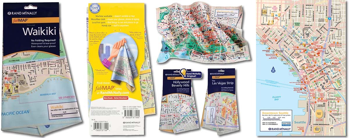
The maps were produced around 2007 as the company was looking for new map products to introduce to the market. The fabMAP titles were focused on tourist destinations such as the Las Vegas Strip, Hollywood, Manhattan, Key West, Waikiki, and other famous places that were often within the downtown area of a city or well-known vacation spots. I recall that the Las Vegas fabMAP was a big hit when it was distributed at one of the Consumer Electronics shows held annually in Las Vegas.
Additionally, college campus maps were discussed and considered along with some larger park or ski resort maps. The college campus map concept never really got off the ground because of the challenges associated with licensing products using the college name or due to permission requirements unique to each university or college conference. The only college title I recall seeing in print was the Ohio State University campus map although many other campus maps were in development at the time.

Pictured: The Ohio State University fabMAP (left) and the Penn State University fabMAP (right) which was developed, but never printed to my knowledge.
The maps were two-sided, with one side usually showing the entire area depicted in the title of the product, while the reverse side would display an inset map of a selected area in greater detail. The packaging was minimal and consisted of a cardboard top section with an open hole for hanging on a display rack and featured the map title and company logo. The cardboard section was attached to the actual map but outside of the packaging so customers could feel the microfiber before purchasing (You can see examples of the packaging in the first image above).
From the cartographic perspective, the maps were simple in appearance, but posed a few challenges during the production process. For one, the product dimensions were small, so the cartographic and marketing teams worked together to decide on which locations would be created and the final map coverage areas that could fit within the space requirements. Since the maps featured a lot of points of interest, it took some time to research all the spotted locations to ensure they were valid places to visit. The street level map data used was imported from Navteq (now called HERE), which was up-to-date and spatially accurate, but costly to use. The cartographers worked with a designer on the final colors, fonts and symbols used to create these detailed maps. The map design was more European in style than traditional Rand McNally atlas or state maps.

Pictured: Both sides of the West Hollywood/Sunset Boulevard/Beverly Hills fabMAP.
In the end, the product was innovative and well received by our customers and a favorite of mine and many of my colleagues. Unfortunately, distribution for these unique maps proved to be difficult, since we usually delivered our maps to large traditional retailers and these maps were geared more toward a counter display at a “gift or novelty store,” and the product was discontinued after a short production run.
Harley Ride Atlas
Rand McNally and Harley Davidson are two iconic brands which had a collaborative and productive working relationship for a long time. Many Harley riders who were part of the Owners Group would receive a custom road atlas that featured dealer locations spotted on our maps along with a comprehensive store directory at the back of the atlas. This atlas was produced for a long time until Harley decided to discontinue the product as part of their Owners Group package a few years back.

Pictured: Florida map with dealer locations spotted and highlighted on the map and index (left) and a page from the store locator directory at the back of the discontinued Harley Owners Group road atlas (right).
Starting in 2006, Rand McNally produced a three-volume set of custom atlases for Harley Davidson as well and I wish these atlases were still made because the size and format were practical, and the custom cartography was fun to produce. The atlases were known as the “Ride Atlas of North America”, since motorcycle enthusiasts often hit the back roads for “rides”. The first edition featured a black, soft cover that felt like rubber, and almost 300 pages of maps, mileage charts, dealer information, and route descriptions written specifically for bikers. One of the other editions even included a custom U.S. wall map along with the usual routes, maps, dealer locations and more. The atlases were compact (8 1/2x11”) in size for easy storage too.
 Pictured: The first edition of the Harley Davidson Ride Atlas of North America from 2006.
As a cartographer, I liked these atlases because the smaller format still included fully detailed maps for each state and province, which meant the Road Atlas maps were cut to fit the smaller format, but we did not have to reduce any map content because more pages were available with the spiral binding. Plus, the route maps were custom cartography, created for each specific bike route, and as cartographers, making custom maps is always enjoyable. The map style for the route maps was different than the main state maps, using subtle background tints for the base map so the route was visible and easy to follow. A vignette technique was also used so the route maps had a soft edge instead of a defined neatline.

Pictured: Sample pages from the first edition of the Harley Davidson Ride Atlas of North America showing the editorial information, photos, and custom route maps.
The main state maps utilized a custom color palette which was different from the regular Road Atlas. The maps were tailored to motorcycle riders, with the minor and secondary roads highlighted in bolder colors as you can see in the image below from Wisconsin. The featured rides and other scenic routes were also highlighted with bright colors and symbols. Each ride included editorial copy along with photos and a lot of useful touring information such as suggested side trips, weather info, gasoline availability, road conditions, websites and phone numbers for state tourism resources, and other insider tips.

Pictured: A section of the Wisconsin state map utilizing a different color palette than our regular atlas maps.
I feel this format works well for a road atlas style map since the smaller size would fit in any vehicle, yet the maps remain detailed and not simplified just because the page size has less room for content. It is unfortunate the relationship with Harley Davidson ended because it was a very interesting project to work on from the cartographic side. However, we still produce custom atlases for companies like State Farm and Good Sam/Camping World, which allows the cartographic team to work on different map styles using innovative map processes and custom workflows.
Thanks again for the question and I hope you enjoyed reading about two of the products I wish we still produced. These were enjoyable products to create from a cartographic perspective, and the map concepts were different at the time, which proved to be challenging yet rewarding once the product was complete and released to our customers.
I will continue this question next time with Part 2 and cover a few more interesting products from the past I wish we still made. In the meantime, feel free to submit your map or cartography questions below and check back soon for another installment of "Ask a Cartographer".
Have a question for our cartographer? Email us at printproducts@randmcnally.com with “Ask a Cartographer” in the subject line and your question could be featured next!