
Lost in longitude or confused by contour lines? Want to know all the tips and tricks for getting the most out of your atlas? Curious if paper towns still exist? "Ask the Cartographer" is your opportunity to get the facts straight from the source.Tom Vitacco, Rand McNally’s Director of GIS is here to answer your burning questions, and geek out over fascinating map lore – one exploration at a time.
This week, we are discussing the significance of colors on our maps.
Question: We have an old Rand McNally Cosmopolitan World Map hanging on the wall in our office and the colors for some countries are a shade of blue and the rest are white. Can you let us know why some countries are blue but most are white? Does a cartographer choose the colors used on a map?
Tom’s Answer:
Thanks for the question. We get asked about the "blue and white colors" used on the old Cosmopolitan World and United States wall maps often, believe it or not. These maps were originally multi-colored and would have included five different color fills to highlight the individual countries or states. We would use five random colors because with five different colors you can fill in the countries or the states without having two of the same colors touch, plus using a color fill makes it easier to see the borders or shapes of the countries or states compared to using less colors or even one single background color. The different colors are often chosen by the cartographer or someone within the design department.
The Cosmopolitan series of wall maps used printing inks and paper that unfortunately faded in natural light faster than anticipated. The color blue usually fades slower than other colors in direct sunlight so all of the other map colors have just faded to white faster than blue over the years.
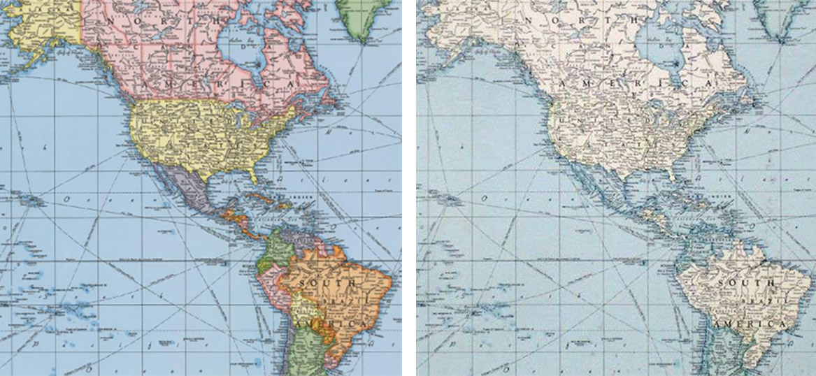
The image above shows a crop of the original multi-colored map (left) and an example of how the map colors fade over time (right).
The colors displayed on a map are important and serve many purposes. Rand McNally has used a consistent color palette for a long time on many of our maps. For example, the map colors shown in our iconic Road Atlas were chosen for clarity and to highlight road hierarchy and to follow an intuitive, logical design. The interstate highways are a darker blue so they stand out on the map and our customers can easily see the major road network within any given state or province at a quick glance. We are one of the only map companies that use a green color for tollways since green is often associated with money and we felt it was important to know which roads have a toll when traveling. We also use subtle green patterns and fills for different national parks and forests, but use a darker green for park icons and a standard red for points of interest so they "pop" without overpowering the map. We do not use a background color on our state maps because we feel the white paper color provides the cleanest background for clarity and legibility and by using a light tan color for surrounding states, the main state map boundaries become clearer.
As cartographers, we have many tools available to assist in picking map colors. Computer technology has made color selection and design much easier than in the past. One notable example is the ColorBrewer website, which was designed by Cynthia Ann Brewer, who was a cartographer and professor of Geography at Pennsylvania State University. The site made it extremely easy to experiment with different colors on a live map and suggested complimentary color palettes. Adobe also had a color palette site which we used to develop colors for thematic maps. We also consult with our design department for color options, especially for custom mapping projects or if we want to try something different. There are even “swatch books” for colors like what you might find at a paint store! In the end, the cartographer will try to choose appropriate colors which complement the theme of the map and allow clarity without overpowering the design.
Thanks again for the questions and if you happen to have an old faded Cosmopolitan wall map, please consider upgrading to a modern Rand McNally United States or World wall map which are both colorful and up to date!
Have a question for our cartographer? Email us at printproducts@randmcnally.com with “Ask a Cartographer” in the subject line and your question could be featured next!